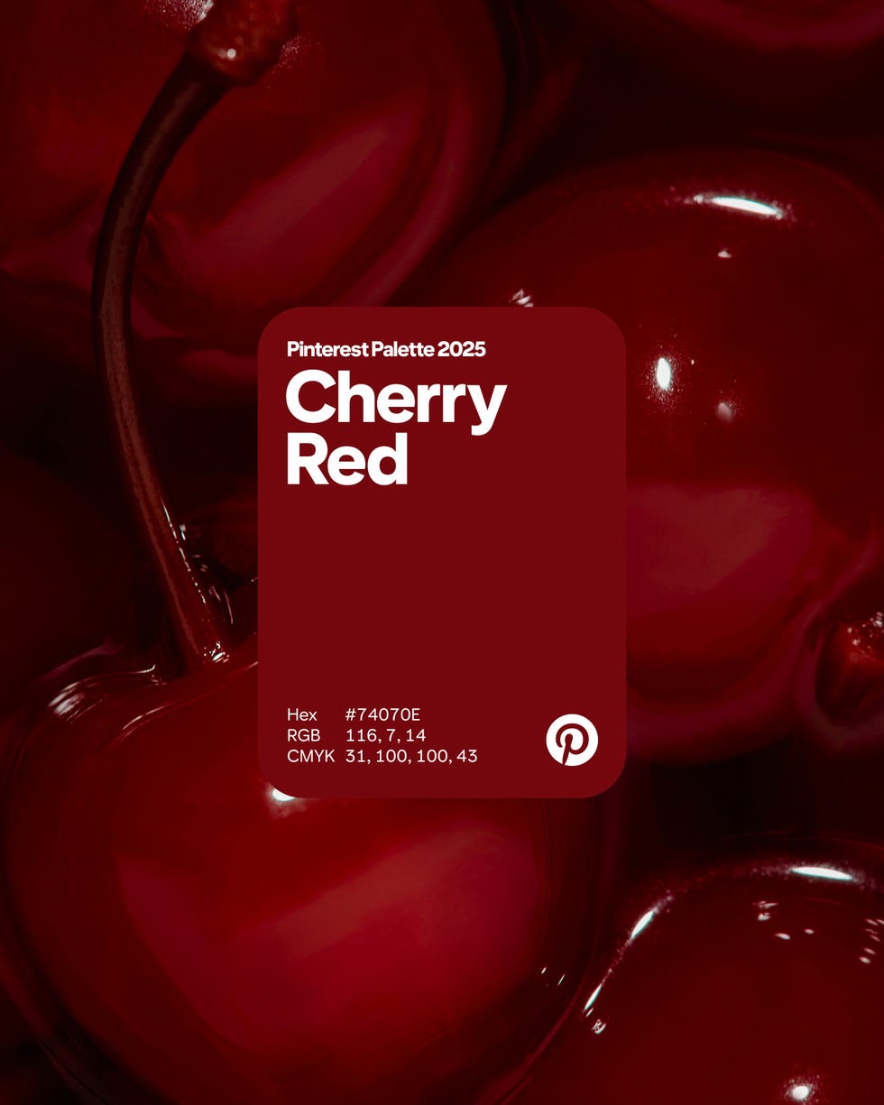
Calling all foodies: we’re poised for a year of tasty colors—that is, according to Pinterest. The creative image-sharing social media platform has rolled out its 2025 Color Palette of the Year—and it’s making our mouths water. The lineup of colors poised to set the tone for what’s next in design, beauty, fashion, and interiors, consists of five hues: Cherry Red, Butter Yellow, Aura Indigo, Dill Green, and Alpine Oat.

The palette builds upon the 2025 Pinterest Predicts trends report, which, no surprise, named the cherry-themed aesthetic the look of the year, as well as one of its colors of the year. “Gen Z and Millennials will infuse cherries into their makeup, menus and mood boards this year,” the platform’s in-house creative team concluded in the report. Pinterest’s Cherry Red, is a rich, vibrant shade that blends the intensity of red with the warmth of brown. It’s not tomato-girl red; It’s not Matisse red; It’s giving cherries—but black cherries. We’ve evolved. No doubt, this hue has been making the rounds on social media and permeating outfits and interiors, from designer Casey Kenyon’s latest project to every cherry-bedecked room idea we’ve seen on TikTok.


Butter Yellow and Aura Indigo, play into more trends that Pinterest has named in their trend report, which found that search terms “purple blush makeup” were up 30 percent this year, with “aura effect” up 35 percent. Both are vibrant and playful, especially together.

Dill Green recalls a rising trend that certainly doesn’t take itself too seriously: pickles. According to the trend report, searches for the term “pickle margarita” were up 100 percent, with “pickle fries,” “pickle de gallo,” “pickle cake,” and “fried pickle dip” also spiking. “Tell your foodie friends: This year will be absolutely dill-icious,” the report read. “From sweet treats to tangy cocktails, the oh-so-humble pickle is about to be in absolutely everything.” And with a hue like Dill Green, we’d wager it will permeate our rooms, too.

And finally, Pinterest named Alpine Oat their finally color. The creamy, vanilla-toned greige is a classic tone that ties it all together, offering a quiet counterpoint to its bold, colorful color colleagues. While we’re clearly raring for a year of vibrancy and taking risks, it’s clear that a solid neutral will always have its place.
Rachel Silva is the associate digital editor at ELLE DECOR, where she covers all things design, architecture, and lifestyle. She also oversees the publication’s feature article coverage, and is, at any moment, knee-deep in an investigation on everything from the best spa gifts to the best faux florals on the internet right now. She has more than 16 years of experience in editorial, working as a photo assignment editor at Time and acting as the president of Women in Media in NYC. She went to Columbia Journalism School, and her work has been nominated for awards from ASME, the Society of Publication Designers, and World Press Photo.