The White Lotus season three is in full swing. We’ve met the characters. We’ve toured the grounds. We’ve let go of our disappointment (sort of) over the loss of Jennifer Coolidge and (spoiler alert) the reappearance of Gary-slash-Greg.
And if you’ve been watching, you know that half the fun is trying to guess what clues are dropped in the show’s gorgeous opening credit sequence, created by the Seattle-based studio Plains of Yonder led by Katrina Crawford and her husband, Mark Bashore. “Our job is to be deeply linked to the show and what it’s trying to represent,” says Crawford.
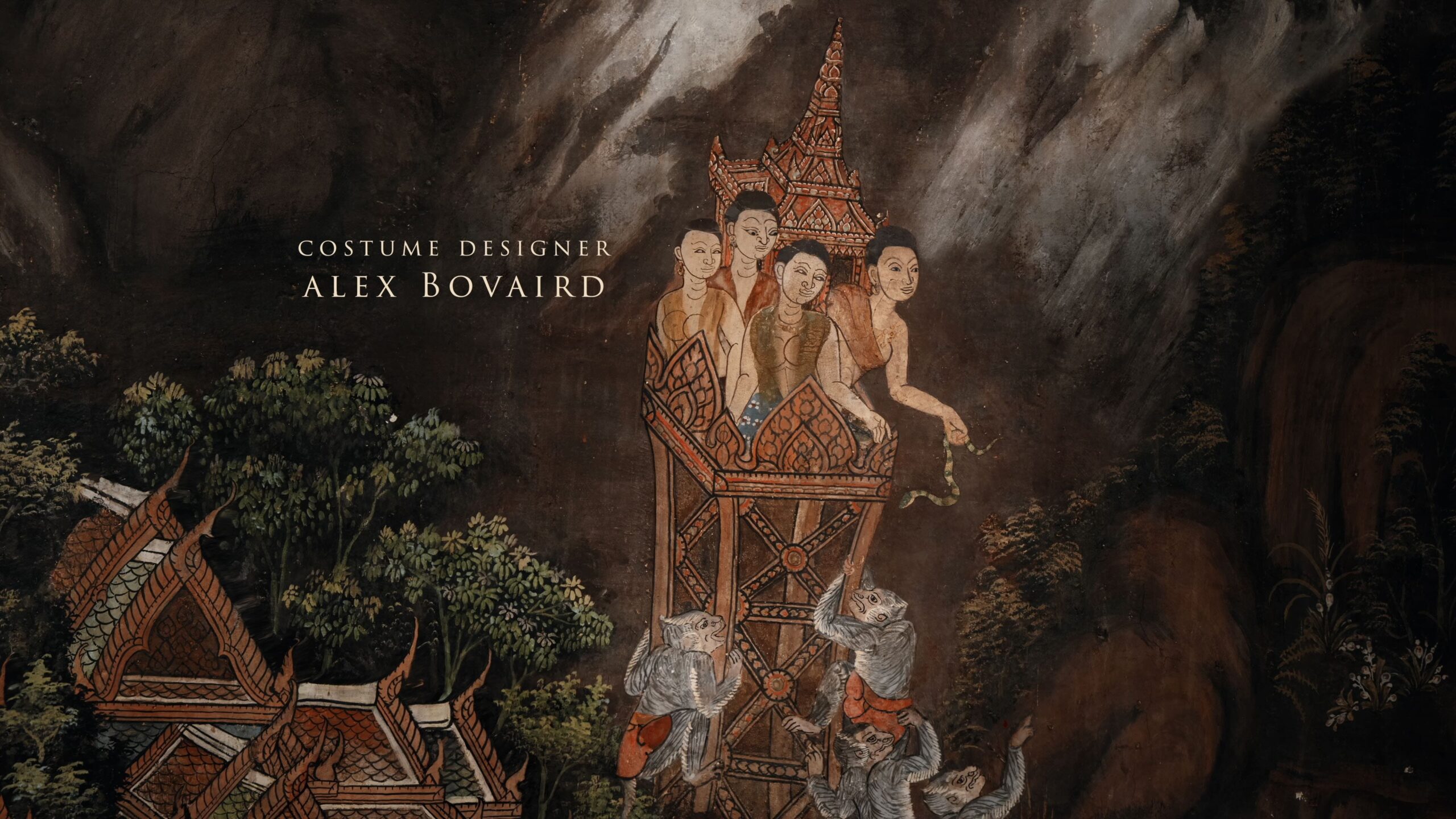
Using still art evocative of the show’s location—wallpaper for season one set in Hawaii, frescoes for season two set in Italy, and murals for season three set in Thailand—Plains of Yonder manages to capture the tone of the show in its entirety as well as something of the essence of the filming location, while also hinting at the drama that’s about to unfold. It’s an explosive minute-and-a-half.
And guess what? Crawford and Bashore don’t just do credits sequences, they also do high-concept design for hotels, restaurants, and brands. So while, yes, we all have a ton of questions about the meaning of the monkeys and the fish and the elephants in this season’s sequence, the real lesson here might just be how the Plains of Yonder team creates visuals that capture mood, tone, and feeling—on screen and off. Let’s dig in.
First thing’s first: The setting is always part of the story
The last time we talked to them, the Plains of Yonder crew had just finished season two of The White Lotus. Culled from Italian frescoes to hit a note of “romance and carnality,” the sequence is bright, sunny, and full of visual winks.
Season three, set in Thailand, is all about the shadows. “We’re trying to create a sense of ill-ease,” says Crawford, “making it so you can’t trust your eyes. Are you even seeing what you think you’re seeing? Or is there something darker at play, some storyline or motive that’s just out of reach.”
It’s also about Thailand. “How do you get that energy of Thailand?” continues Crawford. “What do you need to feel? If we could make you smell, we want you to smell the plants and the earth and the humidity and the heat. So how do we create that?”
With the script and a Thai crew as direction and resource, Plains of Yonder hit temples in Bangkok, museums, and libraries. Their work, Crawford and Bashore like to say, is one third art documentarian, one third art restoration, and one third magician. They pulled scenes from common visuals about rural village life found on murals throughout Thailand (while avoiding the life of Buddha; “We steered clear of those”). “You’ll see people fishing and people in boats,” says Crawford. You’ll also see scenes from what might loosely be called morality tales: “behavior to guard against or people behaving badly.”
The finished product, a moody, multidimensional sequence that reads as staggered wall panels, is “much more akin to tile mosaic than a photograph,” says Crawford.
Subliminal cues and space for the viewer’s imagination
Watch the sequence once and you get it: It’s what you see but also what you don’t see, or can’t quite see, that helps foreshadow the drama in season three. Yes, the animals have meaning (everything is “100% connected,” says Bashore), but it’s the entire tableau that matters. There are “multiple meanings and multiple objects within a scene that are connected,” says Crawford. “We like puzzles.”
Even the choice to use and gently animate still art is part of it. “There’s something about still art in all three seasons,” says Bashore. “People are able to take it in, and in a different way than moving film. This is a main title you could have made a hundred years ago. People make a quicker connection.”
Which means animations are minimal and necessarily subliminal, adds Crawford. “When we’re using effects here, we’re hiding them to create mood and drama.” You feel uncomfortable without knowing why.
And while many elements of the sequence are pointed, they’re also open to interpretation, which is another tool employed to stoke a viewer’s imagination. “As a viewer of anything, you’re bringing a lot of your story to it,” says Crawford. “You’re connecting to different material in the show. We’re all witness to this White Lotus world. We try to build in enough openness for that.”
So, yes, the animals probably do stand for their literal and symbolic meanings (elephants are wise, monkeys are base instincts, harpies are emissaries from the spirit world and snakes are just so biblical, etc.), they’re also just animals. They’re “stand-ins for something that’s easier to express through an animal representation,” says Crawford. “And animals are fun.”
That’s not to suggest you can’t go hard on the meta read of, say, the elephant surrounded by wolves (or dogs?) and foreground to the bird people (again: harpies? Sirens? Kinnari??) when Carrie Coon’s name appears. But the “answer” as it were, is, again, up for interpretation: It’s the goal of Plains of Yonder to “give you tools to engage with the show.” And they know that we know they’re up to something. “You’re coming into the show looking for information, maybe not trusting what you’re seeing, maybe a little bewildered and also sensing the struggle.” And what you make it, well. That’s part of the story, too. “We really geek out on that,” says Crawford. “Yeah, we get just a little bit excited about that.”
And now, make it a hotel: Title sequences or cohesive design, it all starts with a story
“We have clients that are in hotels or restaurants that want this high-level narrative direction that’s connected to visuals,” says Crawford. What they’re looking for is help defining “a world and a mood and a feeling,” adds Bashore. Just like creating a credit sequence, the job is to take that mood and turn it into visuals. “Whether it’s a brand or a restaurant or title, the process is surprisingly similar,” says Crawford.
How it works is, a hotel comes to Plains of Yonder and asks for a story that then goes to the designer, architect, or chef. “It’s backwards design,” says Bashore. “It’s very fascinating to think of it that way.”
Clearly, it’s effective. Check out their work on LAX Bradley Airport. Or consider that to this day, three seasons in, not a week goes by that Plains of Yonder doesn’t get a request for The White Lotus wallpaper. “I’m not joking,” says Bashore, describing the influx of emails that read something like: “‘I have to have this for my dining room, I’ll pay any price.’” Except there is no The White Lotus wallpaper. “It’s a pretend world,” he says. “But we do regret not making the wallpaper.”


