Paint has long been touted as an easy way to transform a room. And it’s true—you merely have to triumph over choice paralysis in terms of color. (Designer-favorite brand Benjamin Moore alone offers more than 3,500 shades.)
And once you’ve moved past the shade-selection process, you naturally want to be playing for keeps. This makes it especially crucial to choose a paint that stays vibrant for years and is resistant to scuffs, stains, and scrubbing. Oh, and you want your hard-won hue to be gorgeous, of course.
Enter Benjamin Moore’s super-premium Aura Interior line, which delivers on all fronts due to its proprietary technologies that make it durable and fade-resistant, as well as the use of the finest pigments and exclusive resins for richer, truer hues. With Aura, even neutrals make a room feel color-drenched. Take a look at these six iconic shades from the brand to see how.
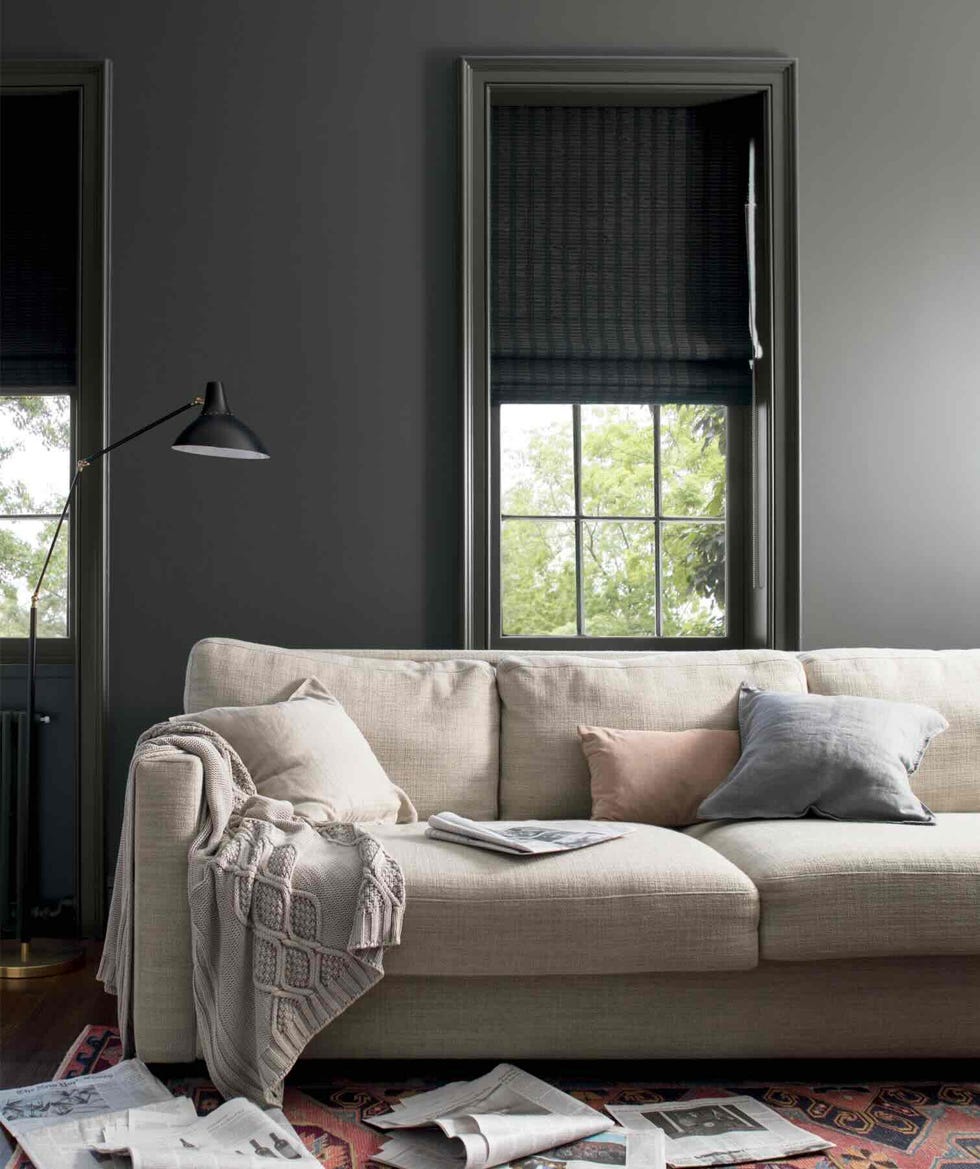
A Dramatic Dark Gray

A room painted in the deep slate gray of Kendall Charcoal (HC-166) practically envelops you, but because the color changes depending on the light, it never feels static or overpowering. You can see the variations above: To the right of the window, where more light hits the wall, the paint leans warm. On the left, it’s indisputably dark gray, even flirting with black. Painting the window frame and door the same color enhances the effect of an elegant cocoon; for brightness and contrast—even in a room that doesn’t get a lot of light—opt for white trim. A good pairing is White Dove (OC-17) (a beautiful neutral in its own right).
And there’s no need to worry about the colors fading over time, thanks to Aura’s unique Color Lock Technology, which uses binding molecules embedded into the paint’s pigments so it will remain striking for years.
A Greige That Plays Well With Others

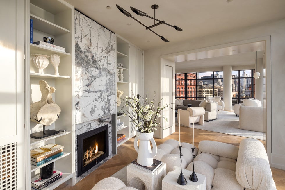
Revere Pewter (HC-172), seen here and in the room at top, is a greige that’s not too warm, not too cool—which makes it just right for almost any color scheme, lighting conditions, or decorating style. One of Benjamin Moore’s best-selling colors, it adds depth and warmth without intruding and is a particularly good backdrop for furnishings in natural colors and materials like leather and wood. It provides more impact than white paint colors do, but still looks clean and minimal.
A Versatile Pale Gray

An underlying hint of violet makes the light gray of Balboa Mist (OC-27) feel warm without tipping over into taupe. Despite being many shades lighter than, say, Kendall Charcoal (HC-166), it still delivers a satisfying contrast with white trim (Cloud White (OC-130), in this case), resulting in a room that’s light and bright, but not all white.
Aura’s premium formula is especially useful with lighter tones like this one and whites, offering impressive coverage: It hides even darker prior paint colors in fewer coats.
The Quintessential Beige

Beige too often gets a bad rap as boring and outdated. Well, Shaker Beige (HC-45) begs to differ—this soft, creamy tan is sophisticated and understated. It’s also a go-to for design pros because it complements both warm and cool tones, making it easy to achieve a harmonious color scheme with virtually any accent paint and furnishings.
A Brilliant White

If you’ve ever decided to paint a room white, you know that the term is deceptively simple—there are literally hundreds of off-whites, from warm to cool, stark to soft. Simply White (OC-117), shown here, is a past Benjamin Moore Color of the Year: With its subtle wink of yellow, it provides just the right amount of warmth. It’s among the dozen all-time top-selling whites for the brand, along with its cousins White Dove (OC-17) and Chantilly Lace (OC-65).
Classic Navy

Navy often acts as a neutral, grounding a space, and few versions do so as powerfully than the deep, dark blue of Hale Navy (HC-154). With its gray undertones, it’s a heavy hitter that adds polish and personality. Aura’s proprietary acrylic resin provides resistance to scuffs and keeps color and sheen intact even after scrubbing, so it’s a good choice for high-traffic areas like kitchens, hallways, and kids’ rooms.